Availabilities/Reliabilities
- Availability/Reliability
- Availability/Reliability Table
- Daily Availability/Reliability Table
- Availability/Reliability Charts
- Other Functionalities
Availability/Reliability
Availability: Service Availability is the fraction of time a service was in the UP Period during the known interval in a given period.
Reliability: Service Reliability is the ratio of the time interval a service was UP over the time interval it was supposed (scheduled) to be UP in the given period.
From this page you can see the latest values for monthly repoorts for A/R for your infrastructure. A report is actually a configuration file that is used to describe the services you want to check, the metrics you want to use for each service and the grouping of the services.
The report may contain A/R values based on the group you chose in the Configuration Management Database :
- Sites : List of services that participate in the site
- Project: A list of services that are used in a project.
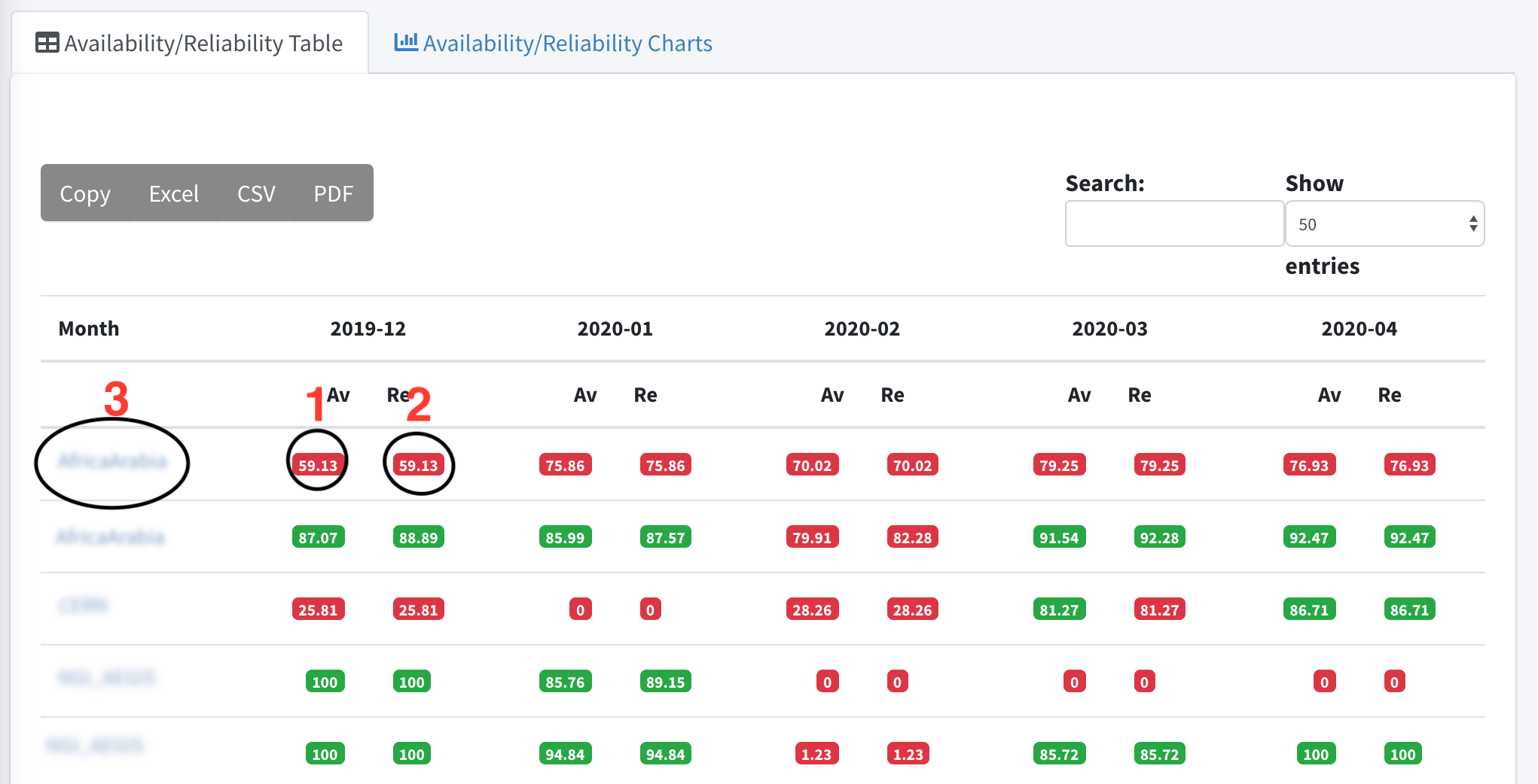
Availability/Reliability Table
This is table with the main information. The Availability and Reliability values for the last 4 months.
If you want to learn more about the daily availability or Reliability values of a specific month the only think you can do is to click on a value of Availability or Reliability (like option 1 or 2 in image 1 ).
If you want to learn more about the services or the endpoints of the services you can clink on the name of the group you want (like option 3 in image 1 ) and drill down to other options.
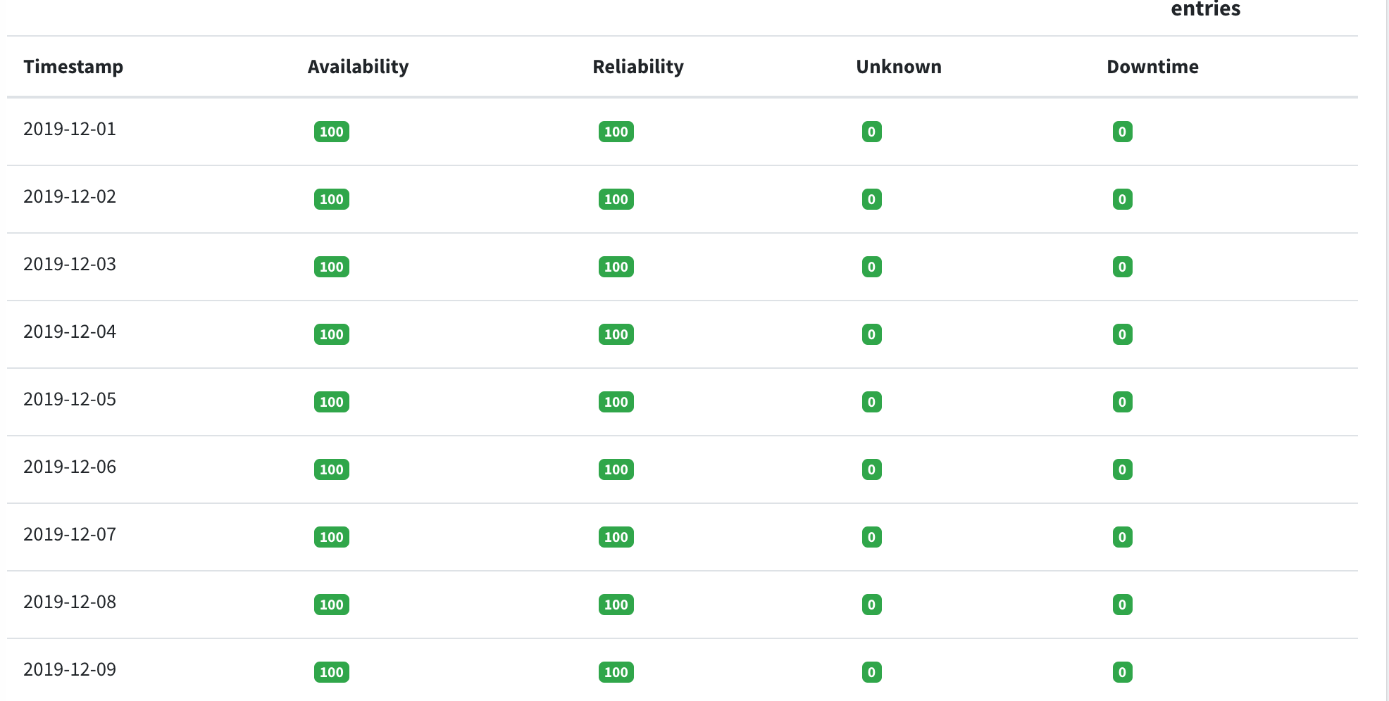
Daily Availability/Reliability Table
The Daily Availability/Reliability Table display information about:
- Availability
- Reliability
- Unknown: the period (start_time --> end_time) in which a specific service / service endpoint was in an unknown Status. In this table we provide the percentage it was unknown during this day.
- Downtime: the period (start_time --> end_time) in which a specific service / service endpoint was in scheduled downtime. In this table we provide the percentage it was in scheduled downtime during this day.
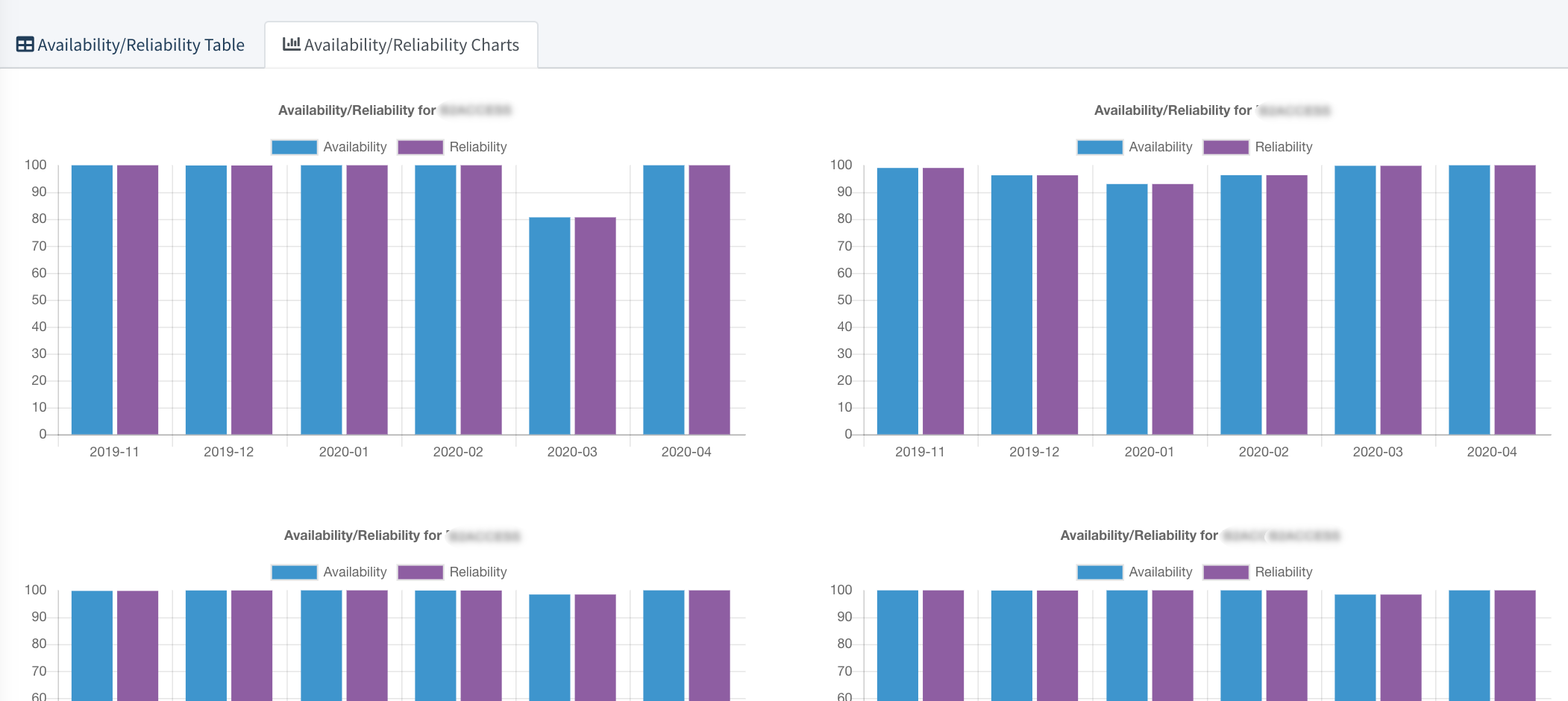
Availability/Reliability Charts
A graphical representation of data, and in which the data is represented by bars in a bar chart. This chart compares Availability and Reliability values for the last 4 months for each item.
Other Functionalities
All the pages under this section offer the functionality of searching in the results of the existing page.

All the pages under this section offer the functionality of copying the data to clipboard or even exporting them to different formats like excel, csv, pdf.

Status
Introduction
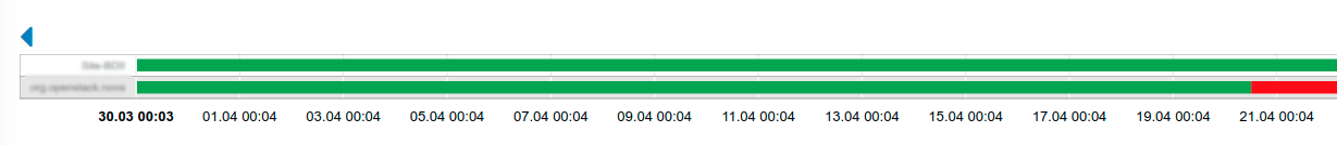
This is the page where you may see the status for the whole infrastructure while at the same time you can drill down to services, service endpoints and metrics.- Before we start some definitions about the services, service types and service endpoints.
- From the ARGO monitoring service perspective, a monitored infrastructure is composed of a group of services.
- Services are composed of service instances of a specific Service Type, which are called Service Endpoints.
- A Service Type is a group of metrics that are checking a specific service from the monitoring perspective.
- Each Service Type can have a defined set of metrics, which are explicit tests that we run in order to assess the status of a Service Endpoint.
Status Page : landing page
Τhe first information you can see is about the groups you have (ex Services) . This page is automatically updated and it displays near real time information about the status of the groups.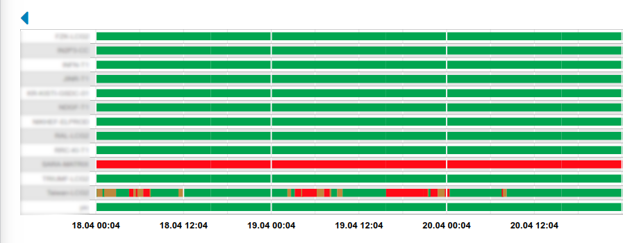
- Above the timelines there is an arrow that can help you navigate through the days (divvious or next when available).
- You may drill down to the services page and get more information about the services endpoints and finally about the metrics
How is the status computed?
- The ARGO Analytics Engine expects to receive a stream of metric results produced by a monitoring engine.
- A metric result is the output of a specific test that was run at a specific time against a specific service endpoint.
- A metric result includes at least:
- a timestamp showing when the given monitoring probe was executed
- the name of the service type (e.g. HTTPS Web Server)
- the name of the hostname on which the service is running (e.g. www.example.com)
- the name of the metric that was tested (e.g. TCP_CHECK)
- the status result that was produced by the monitoring probe (e.g. OK)
 {
    "timestamp": "2019-05-02T10:53:38Z",
    "metric": "org.web.check-tcp",
    "service_type": "HTTPS Web Server",
    "hostname": "www.example.com",
    "status": "OK"
}
The main statuses you may see in the timeline are :
- A OK state that means that the operation of the service endpoint / service / service group is normal
- A WARNING state is used for situations when service is still functional, but it is in a non-optimal state. This state is most often used in combination with thresholds, e.g. if response time is more than X or certificate lifetime expires in less than X days. This state changes the state of the / service / service group based on the profiles defined.
- A CRITICAL state is used for situations when service is not functioning properly or at all. This means that the service is not responding correctly to the checks metrics that are executed. This state changes the state of the / service / service group based on the profiles defined.
- A DOWNTIME state, that means that the service endpoint / service / service group has declared downtime for a period.
- A MISSING state, which is used in order to fill the timelines when a metric isn’t divsent in the consumer data for a period of time
- An UNKNOWN state, which is used in order fill the timelines when a re-computation exclusion is applied
TCP_CHECK and CHECK_CERTIFICATE_VALIDITY.
In order for the website to be considered as OK, the results for both the tcp check and the check for the certificate validity must be OK.
How the individual results of each metric for a Service Type are combined in order to compute the status of the Service Endpoint, is defined in what we call truth tables.
The truth tables can be updated for each infrastructure
Dashboard
Introduction
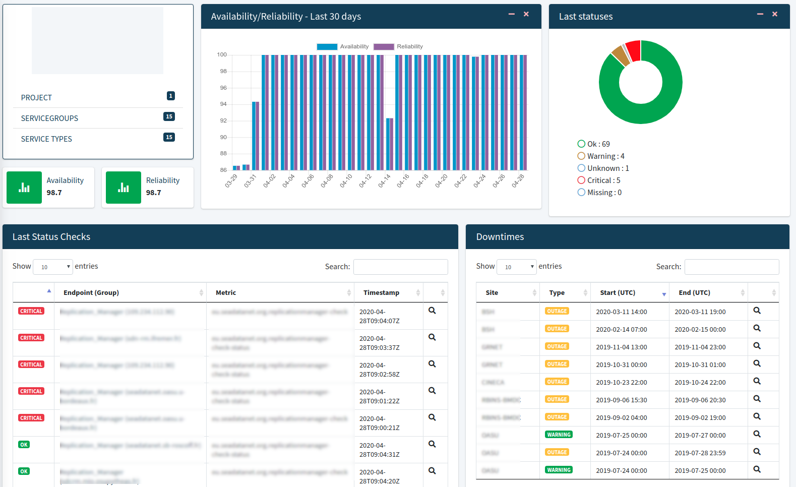
- The main information consists of
- the description of the topology - structure (project, sites,) and list of the related entries
- the results of availabilities/reliabilities for the last 30 days
- The last status check via a donut chart . (more information below)
- The last status changes.(more information below)
- The downtimes affecting the the services (more information below)
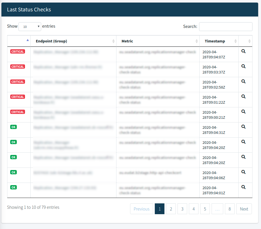
Last status checks
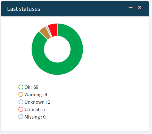
Donut Chart
The doughnut chart shows the last status checks. Pie and doughnut charts are probably the most commonly used charts.
They are divided into segments, the arc of each segment shows the proportional value of each piece of data. Here the segment is the different results of checks
You may see the number of Critical, Missing, Ok, Unknown, and Warning Checks.
 >
>Last statuses Table
From this table you may see the 500 last status changes with the distribution and the details of these changes.
This table has the functionalities of searching and sorting the data in order to find the check you are looking for.
At the bottom of the table pagination is enabled to help you navigate through the results. Βy clicking on the lens icon you can see more information about the status.
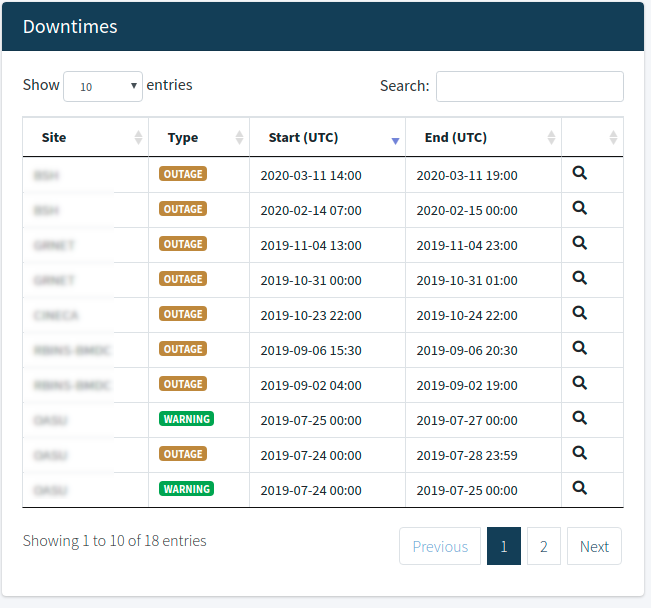
Downtimes
From here you may see the downtimes affecting the sites/services. This table has the functionalities of searching and sorting the data in order to find the check you are looking for.
At the bottom of the table pagination is enabled to help you navigate through the results. Βy clicking on the lens icon you can see more information about the downtime.
Custom Report
Introduction
In ARGO UI we provide some predefined Availability, Reliability and Status reports. A Custom Report is a report that you create.
From this page you can create your own custom report for the service you desire.
What is a custom report ?
A Custom report is a report about a service in a selected period of time.
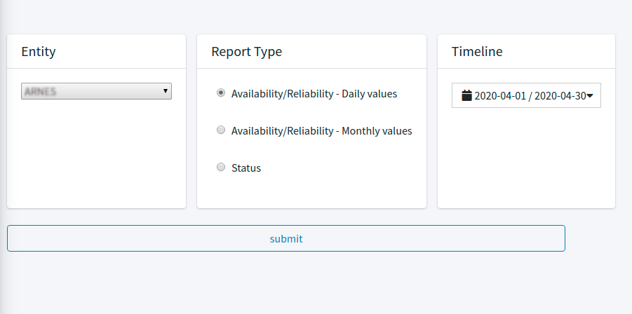
- In order to create your report you must specify at least:
- Entity: The entity you want to get the report about
- Report Type: you can select the type report a) Availability/Reliability - Daily values, b) Availability/Reliability - Monthly values, c) Status
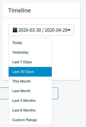
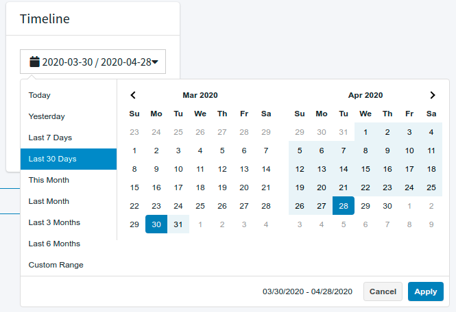
- Timeline: The period of time for the report like Today, Yesterday, Last 7 Days, Last 30 Days, This Month, Last Month, Last 3 Months, Last 6 Months or a Custom Range.
Results
According to the type of report you select the results are shown in the following images.
Availability/Reliability - Daily values
In the following image you may see the results for the custom report. It shows the daily values for Availability , Reliability , Unknown and Downtime for the service you selected. You can also export the results in different formats like Excel, CSV, PDF.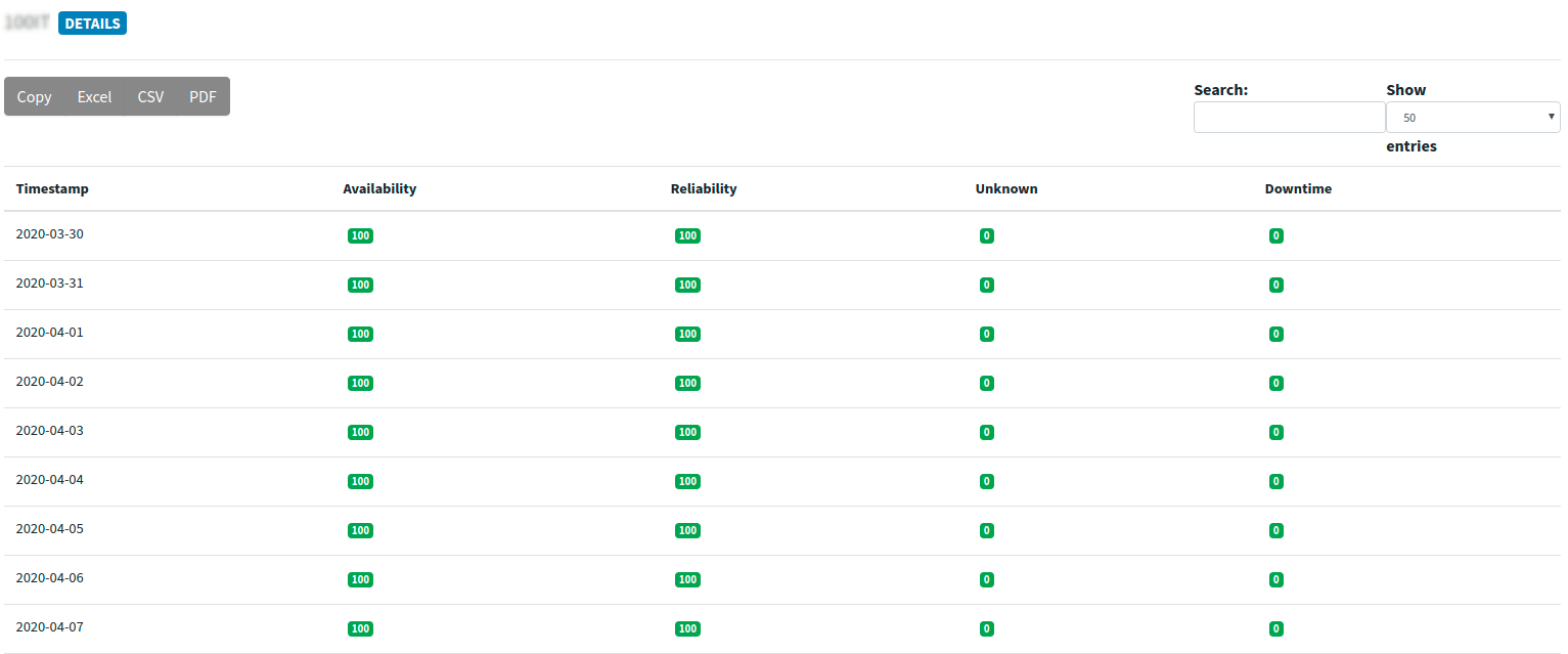
Availability/Reliability - Monthly values
In the following image you may see the results for the custom report. It shows the daily values for Availability , Reliability , Unknown and Downtime for the service you selected. You can also export the results in different formats like Excel, CSV, PDF.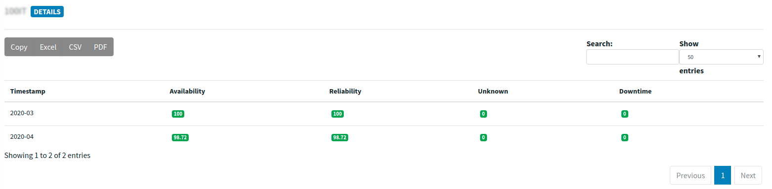
Status report
In the following image you may see the results for the custom report. It shows the status values for the service you selected. You can click on the timeline and drill down to the endpoints so as to see the statuses. If you need more information about Status you may also visit the Status documentation page.